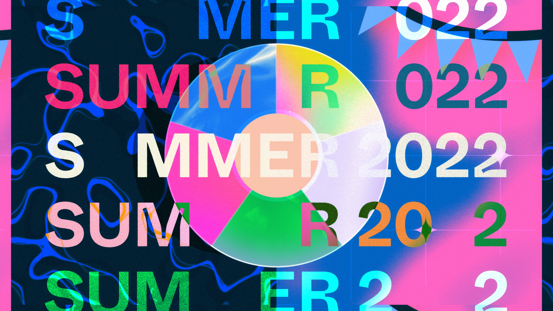
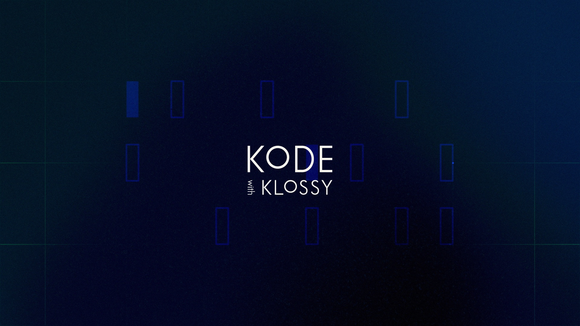
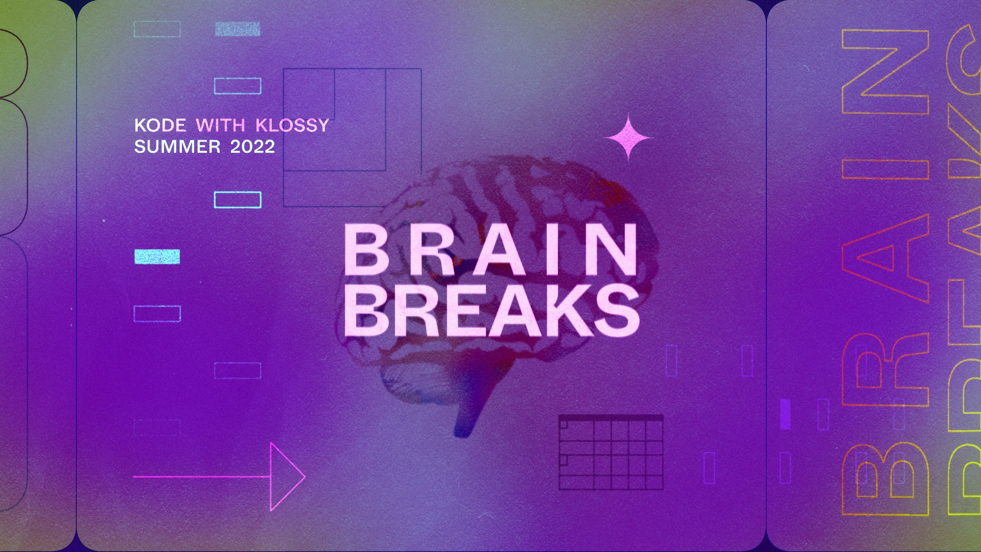
One summer I collaborated with Kode With Klossy to create an animated identity for Brain Breaks: segments of the program that provide scholars with an active rest from coding plus an opportunity to engage with the camp experience in a fresh way.


SUMMERTIME
0:01:08
0:01:15
0:01:18
0:02:06
0:08:09

0:10:08
0:14:18
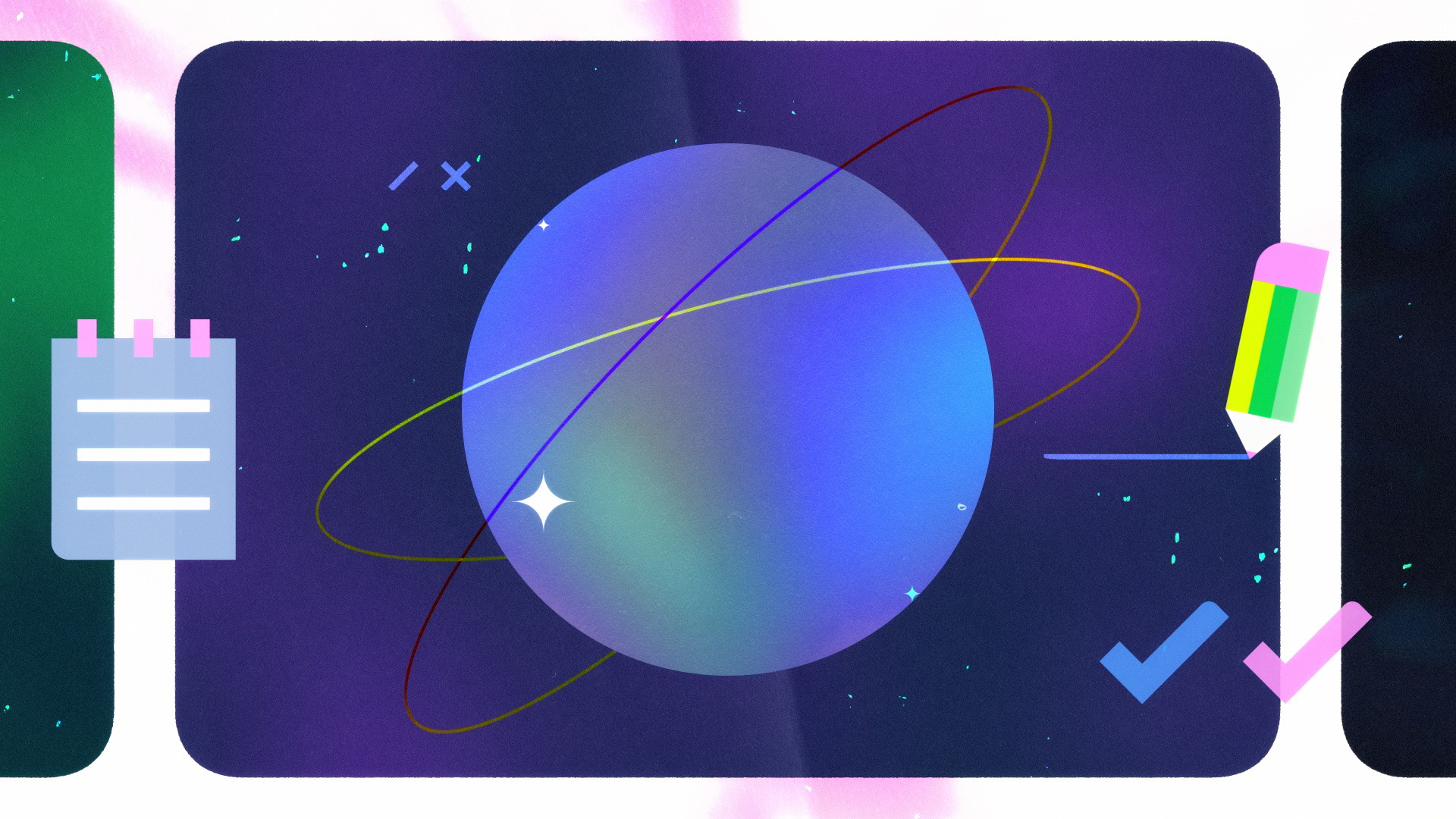
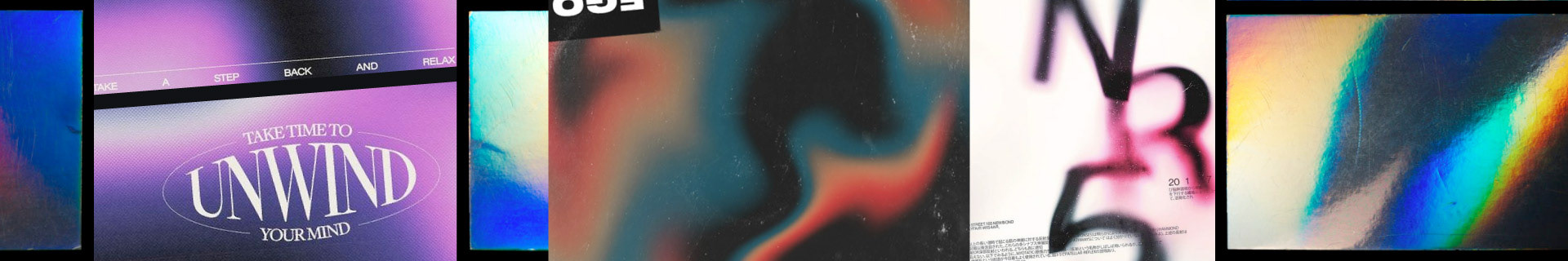
Retreating through these vivid layers of imagery, the animation describes taking a mental step back. A break for the brain.
The blend of choppy and smooth motion technique reflects a mashup of ideas in a dynamic learning environment.
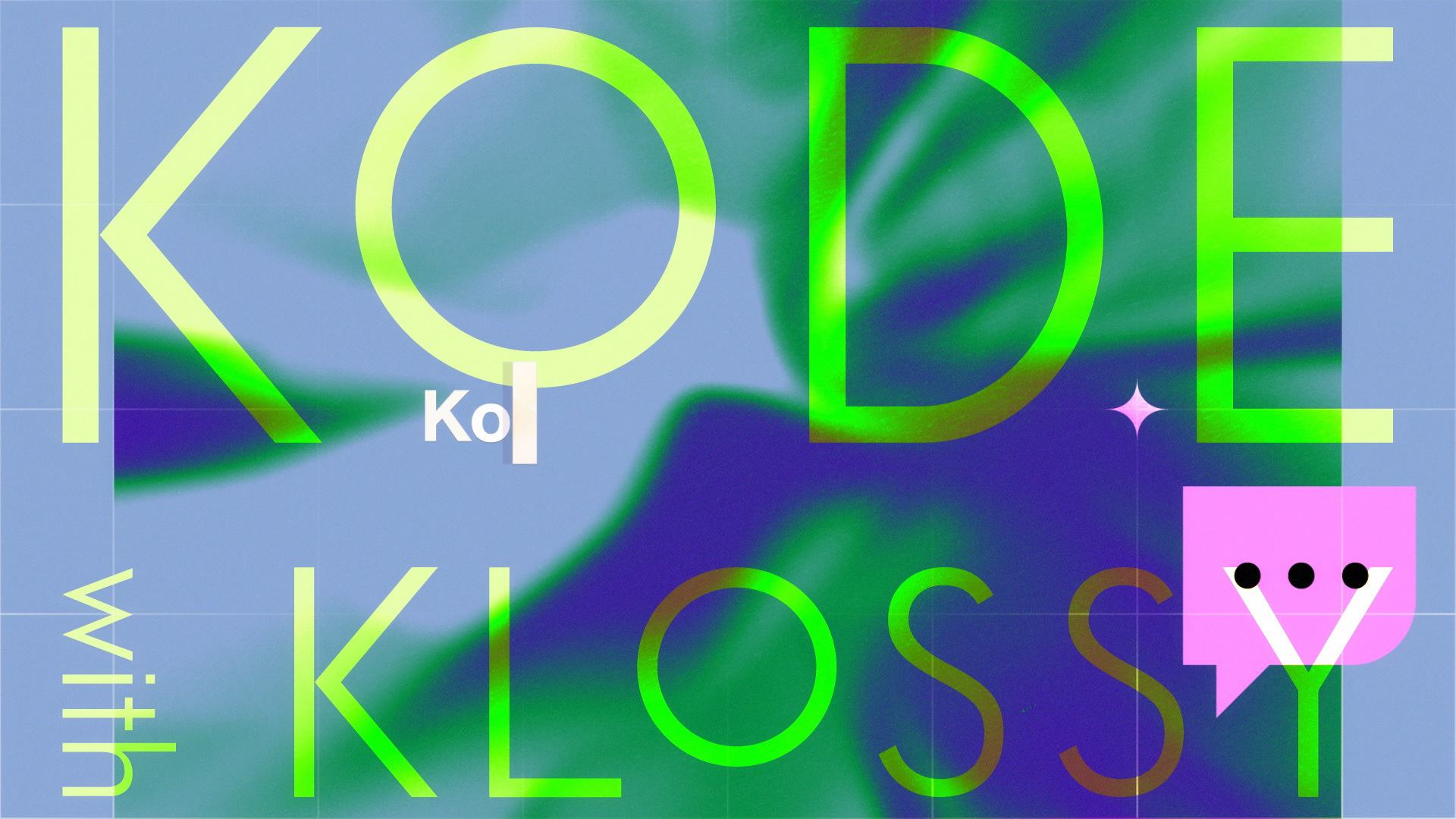
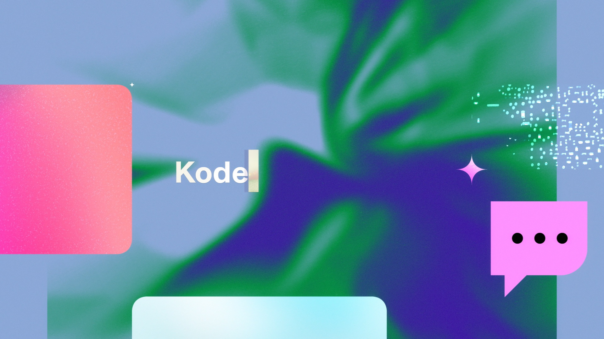
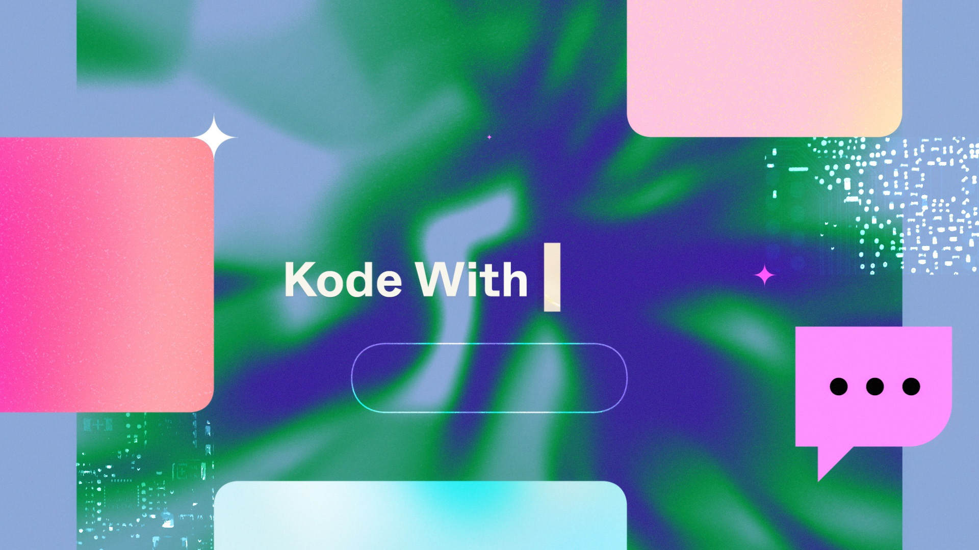
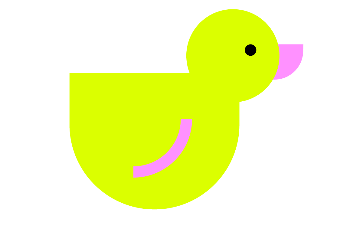
Among available assets were the logo, fonts, an electric color palette, and a library of punchy graphic elements. These graphics were a key feature of the art direction, bringing considerable personality and substantial vibes to the table.
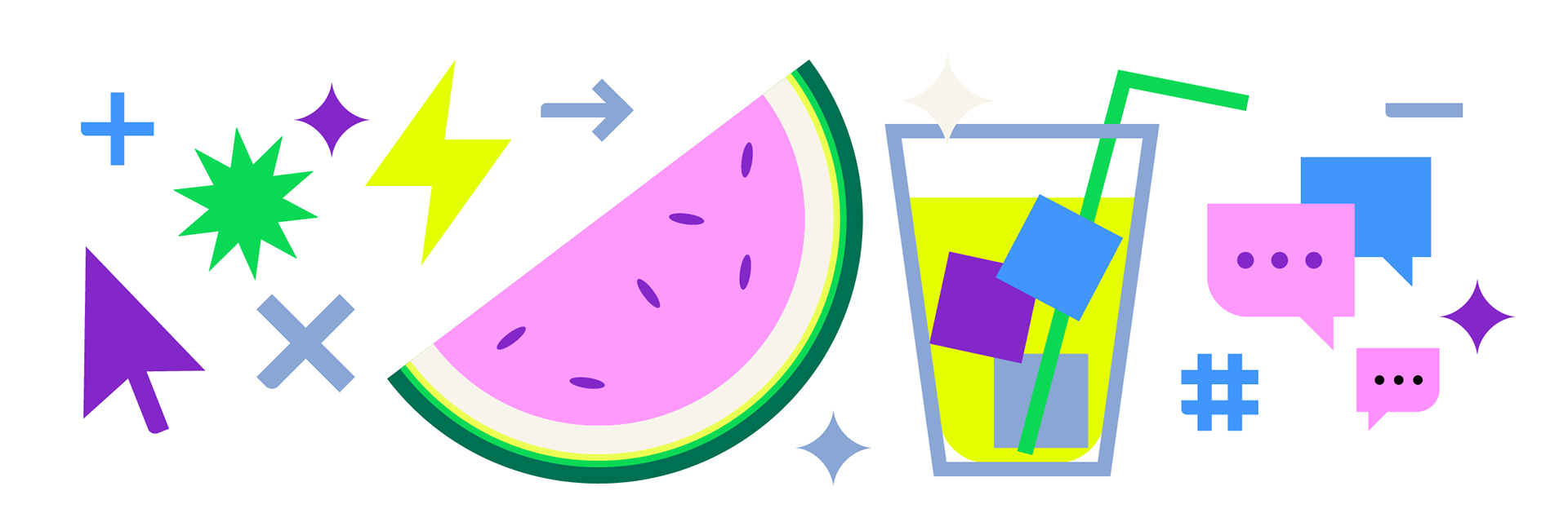
Remixing the brand materials produced a compelling visual toolkit.
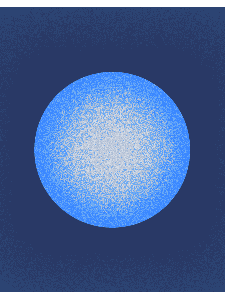
Meanwhile i pre-rendered a set of animated background textures which could be applied to the designs and re-purposed from shot to shot. The loops imbued the designs with a sense of depth and steady evolution — that dreamy, ephemeral vibe.
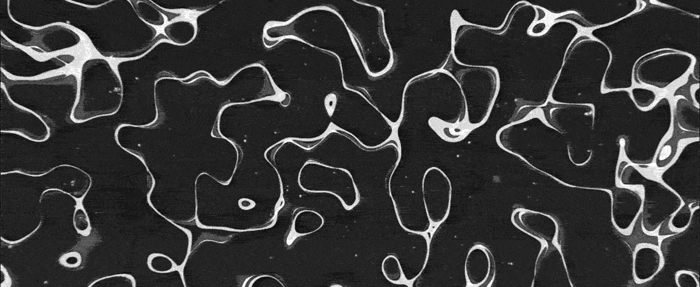
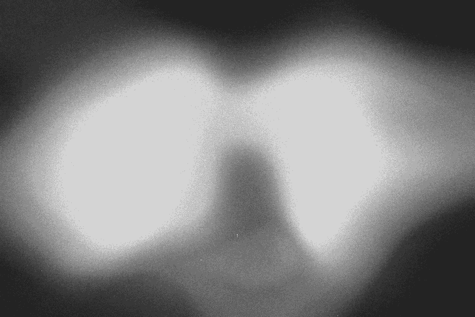


Texture played a decisive role in tying everything together. Initially, my designs relied on a fairly literal implementation of brand graphics with hard lines and solid colors ...

With further dialogue, we guided the creative direction toward the final result.
VISUAL References, RETROSPECTIVELY
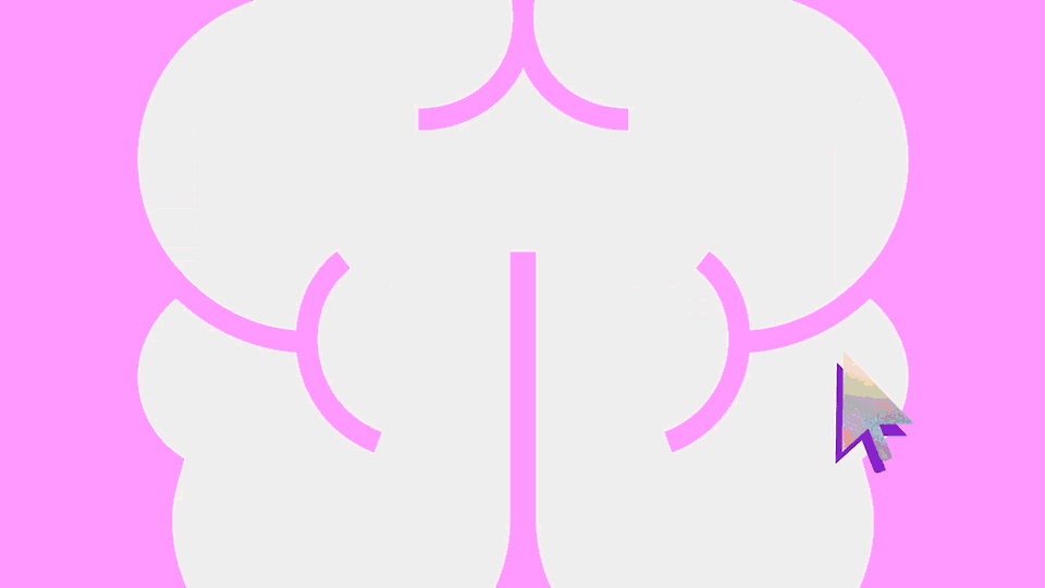
an earlier (unused) version of the end page, before we found the stylistic sweet spot